
Chart: Boom & Bust in Developed Markets
A look at the long-term trends/cycles and the current valuation divide within Developed Market equities...

The history of valuations (in this case looking at the Price-to-trailing 10-year average Earnings [PE 10 Ratio]) across developed market equities has been one of cycles of divergence and convergence as countries’ sharemarkets walk similar but different paths. This week’s chart illustrates these longer-term trends, but also some interesting divergences (and convergences) more recently.
The first point of interest just zooming out to the bigger picture is the cycles of boom and bust, of euphoria and despair …and all 4 markets show multiple cycles of extreme highs and lows across the past 4 decades. This is interesting from an investing standpoint as it validates the idea that there are sometimes better opportunities (+risks to be avoided) by looking globally and across countries (and in across market cycles).
The second observation of intrigue is how all 4 lines started at the roughly the same point back in the depths of 08/09 …but went on to 4 very different paths (mileage can still vary despite similar signals).
The final point is just how far the USA has pulled away from the pack (for a while there NZ was valiantly keeping up, but the 2020/21 stimulus bubble burst put an end to that). As the USA charges deeper into boom/bubble territory, the prospect of eventual inevitable bust comes to mind… but what also comes to mind on the optimistic end is the catch-up trade that appears to be underway for the rest of developed markets.
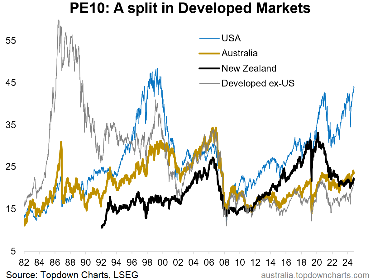
Key takeaway: The history of boom/bust echoes on today, with the USA out in boom territory, and the rest of developed markets offering the prospect of catch-up from still relatively low levels of valuation.
This note was brought to you by the Australian Market Valuation Book
About the Australian Market Valuation Book
The Australian Market Valuation Book features exclusive, innovative, and insightful indicators to provide Clarity and Decision support to Australian investors +those who allocate-to or are interested in understanding this market.
Specifically, the pack covers:
Australian Equities (ASX 200, Small Ords, Banks, Resources, sectors, AREITs).
Australian Fixed Income (corporate credit, government bonds, rates)
Other key markets (AUDUSD, A$ Gold, housing)
Capital Market Assumptions (expected returns for the major assets)
The pack focuses on delivering insight into:
Valuations: is the market cheap/expensive (or neutral)
Trend: is the market in an up/down trend
Price: updates and visibility on where things are tracking
Relative value: comparing absolute and relative prospects
Overall it’s an easy way of quickly and efficiently understanding where the big risks and opportunities are in Australian markets.
Act Now — activate a 7-day trial pass to get instant access to the latest chartbook (+archives) and see if it’s right for you:
Best wishes,
Callum Thomas
Head of Research & Founder
Topdown Charts | www.topdowncharts.com
LinkedIn: https://www.linkedin.com/in/callum-thomas-4990063/
NEW: Other services by Topdown Charts
Topdown Charts Entry-Level — [TD entry-level service]
Topdown Charts Professional — [institutional service]
Weekly S&P 500 ChartStorm —[US Equities in focus]
Monthly Gold Market Pack — [Gold charts]
Australian Market Valuation Book —[Aussie markets]